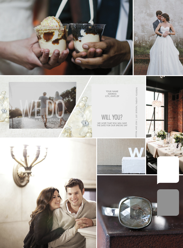
Today, we're featuring a popular photo Save the Date design entitled Our Vow + designer, Rachel, tells us how you can incorporate this popular trend into your Save the Date! "A popular trend in photo Save the Dates is using one large image as the background and laying text over it. When you place text directly over the image, it immediately becomes the focal point.
With Our Vow {Save the Date Postcard featured in the inspiration below}, opaque text is placed over your image to make a big statement. The right photo can make or break the design. Since each design is entirely based off the background image, here are a couple things to keep in mind when choosing the perfect picture to showcase: 1. Use an image with plenty of white space. In other words, images zoomed in really close will be harder to use. Talk with your photographer about your vision for your save the date so that they can make sure to take a few shots with plenty of background all around you. 2. This is a great time to focus on other details. Hold hands or bring the focus to your feet. Even if you're not looking at the camera, the right image can bring plenty of emotion to the picture. Use your outfits or props to bring color to your Save the Date. You can then use neutral or lighter colors for the text and really make your photo shine!" What do you think about this photo Save the Date trend?  Photo credits For allowing us to use their photography, much thanks to ... Ice Cream by Jasmine Lee Photography Bride and Groom by CarolineRo Table Setting by Jamie Delaine Photography {via Elizabeth Anne Designs} Cake Topper by Host and Toast Studio Couple by Aaron Delesie {via A.K. Studio} Ring by Alexis Russel Design

 by:
by: 


