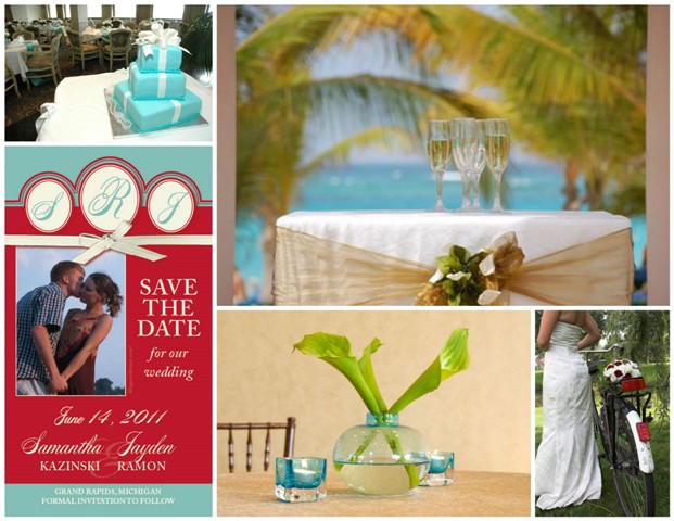
If Pantone the color boss says it... it must be true. As you may know, Turquoise has been declared the alpha color, the top tinge for 2010. Over the next few months, you'll hear the word "trendy" wrapped tightly around this color but I think it's forever stylish and a solid choice. Stunning whether you incorporate it as a main color or as an accent. Think tropical blue waters and warm, sunny days.
I took the color boss' suggestion and paired this yummy color with the likes of the new "classic" red...Tomato Puree. I used the design studio {although not exact} to convert Pantone's Turquoise CMYK: 61,0,32,0 and Tomato Puree CMYK: 0,75,78,13.
I absolutely adore this high energy combination. So fun.
And behind every great color is a great neutral! These are the shades to set the stage for spring: Pink Champagne, Tuscany, Dried Herb and Eucalyptus as the ultimate grey. LOVE the neutrals for this spring!
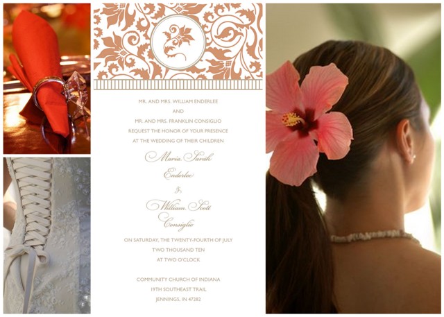
Another lovely color for Spring 2010 is Fusion Coral {yay for coral~even though we've been admiring this one for a while}. Using the design studio {not exact~coral cmyk: 04,49,55,0 and tuscany cmyk: 0,20.31,25} I changed the colors on this damask Invitation from black and white to the Coral and Tuscany...
soft, warm yet energetic at the same time!
So what do you think... did Pantone hit that color nail right on the head?
Happy Friday!
Monogrammed Love Mini Save the Date magnet
Traditional Damask Invitation
Save the Date gallery
Invitation gallery
 by:
by: 


