Celebrating our national icon today ... the great civil rights leader ... Martin Luther King, Jr.
Being Monday and Color Monday, we've been exploring Pantone's color of the year, Emerald. We've discussed the mood Heritage and now we're on to the next one!
Simply put, Emerald, exudes positive connotations. With a jewel-like name, Emerald speaks to luxurious and up-scale surroundings. So, it comes as no surprise that Pantone has created a palette known as Sophisticated that includes Emerald green. Combined with neutrals (grey, black, white, and brown) every color is immediately infused with class. You know how polished a palette of black, white & red is ... well, Emerald green makes the same claim to sophistication--just more subtly.
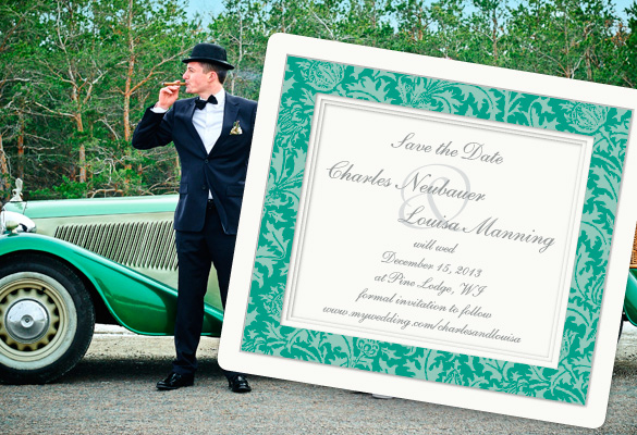
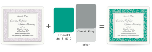
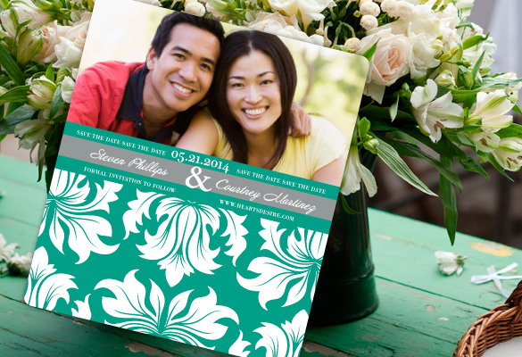
To try out this sophisticated palette, three Save the Date Magnets have been personalized with Emerald, Classic Gray and Silver.
Can you believe how fabulous this Classic Violet Save the Date looks in Emerald? It's such a traditional magnet and our bejeweled green simply brings the whole look to life! The pattern and the text are so very formal. It inspires a vision of a vintage wedding steeped in tradition of a by-gone era. Women in fancy dresses and men all dressed in their suits. Formal china shining and candles everywhere. It would be so classic!
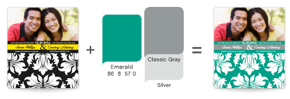 Personalizing this design with Emerald green really could be your Heart's Desire. Lightening the deep black of this damask pattern with emerald lets the whole design soften. It suggests a lovely garden event--with beautiful blooms in delicate shades dotting the reception hall and washing the space in living green. I imagine a formal wedding, yet dotted in casual elegance in a lovely setting.
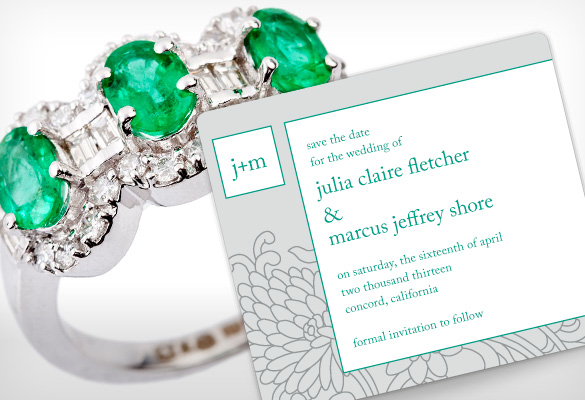
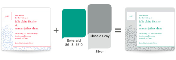
Transforming this Save the Date with Emerald green is a thing of Pristine Beauty. Exchanging bold colors for a more neutral palette of grays instantaneously creates a feeling of culture and sophistication. Using a neutral color palette conveys a reserved elegance. Letting green show up as little pops of color on a neutral background keeps your guests filled with anticipation--wondering where this green will show up next! Imagine emerald appearing on the groomsmen's bow ties, again in the wedding shoes and perhaps as two little green flowers on top of the tiered cake.
In truth, doing this with any color will create an air of sophistication. There's something refined about controlling color in this way. So if sophistication is what you're looking for, try using only one color vary sparingly. Give it a try yourself by personalizing any one of our Classic Save the Dates or Classic Wedding Invitations. The design elements will start you off in the direction you're looking for!
How will you make your wedding color pop?
Lindsay
Designer for MagnetStreet
 by:
by: 