It's all about you and how you're using the Design Studio to upload cool photos, change colors, fonts and text to create unique Save the Dates and Invitations.
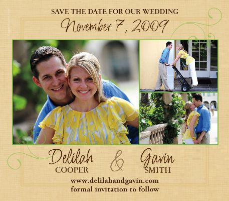
Our featured couple chose Swept Away save the date magnet... the clean simple lines, great fonts and ability to share multiple photos, makes this save the date a fantastic choice. I love the color changes our couple made ~ the colors are fresh and crisp and the photos... so fun! Everything just works well together~ especially the green trim and accents around their photos and also how the close-up photo balances the two on the right, offering a wonderful sense of depth and richness to the overall look. Just gorgeous!

And, this adorable bride-to-be was so sweet to share with me not only the vision for their Save the Date but also for their wedding... a sophisticated event reminiscent of all things Italian and Napa Valley.
Enjoy...
"So far the most difficult part of the wedding planning for me has been choosing my colors. I like everything! What brought me to the STD colors were a number of things: My fiance' and I got engaged in Napa and I am Italian so we wanted to incorporate things from those regions of the world in colors and decor.
Our reception is going to be at a golf/country club and has an Italian look with tall cypress trees and old architecture~ while at the same time, exuding sophistication and class.
Our centerpieces will incorporate grapes and grapevines to remind people of our engagement in Napa. We are also giving olive oil as favors {one of our favorite things}.
I want the look and feel of our wedding to be glamorous as well as rustic. That has been tough to do together, so with the use of browns and metallics with a punch of color, we are able to make that happen.
Our wedding website {designed by my aunt} features browns, golds and wine colors and was the initial inspiration for our STD. My bridesmaids are wearing latte and both my maid and matron of honor are wearing apple green, so those colors also added to the inspiration for our STD. The MagnetStreet website enabled me to try different colors and fonts {keeping the fonts as close to our website to keep it cohesive}. That is how we landed on the brown type, gold background and green accents. They just worked so well together and fit right in with what we were going for.
We have wanted to personalize each detail of our wedding so it was important to us that we could try things out and the MagnetStreet website gave us that opportunity. Once we decided on colors and fonts, we tried different pictures from our engagement session with our amazing photographer Javon from Javon Longieliere Photography and the final product became reality!
It turned out just as we had hoped and we have had so many great compliments from our friends and family about how much they liked it!
I think we will try to stay with the same colors as we move forward. The browns, golds, ivory/creams will be our base and the apple green and wine colors will move forward as our accents... so you will see those colors again in our flowers and perhaps even in the groomsmen ties! I could go on and on!"
Easy to "go on and on" once we get talking about our wedding... I love it! Thanks so much for sharing! I can't wait to see how your vision is finally realized on the wedding day! I know it will be exquisite!
{if you're interested in becoming a featured bride on Truly Engaging, feel free to send me an email.}
have a great weekend!

 by:
by: 


