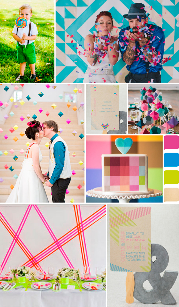
Want a unique wedding look? Here's one: neon! Clearly not for everyone, it's hard not to smile and be charmed by the bold and high-energy color schemes. Here's Megan to take us Behind the Design of her Flirty Neon--a Save the Date and Invitation Suite that celebrates this retro look--that's still trending.
Colors > Cornflower, Azalea, Custom Chartreuse, Kraft Paper "Flirty Neon was inspired by the neon graphic lines and geometric shapes that guide your eye around the page. It was born from modern inspiration and flirtatious copy to engage your guests from the beginning. The graphic elements strategically line up as pieces fold and interact over different cuts and panels. I imagine a modern wedding filled with a very fun and energetic wedding party, crazy wedding details and interactive activities for guests to take part in. Flirty Neon captivates your guests from the beginning, something that leads to a very memorable wedding day. Who wouldn't want that!?" So tell us {cause we know you have a strong opinion} are you crazy for a bold, bright scheme like neon? Or not so much? :)  For giving us permission to use their photography, much thanks to: Ring Bearer by Kayla Adams {via Ruffled} Confetti and Geometric Centerpiece by Lauren Fair Photography {via Ruffled} Cake by Studio EMP {via 100 Layer Cakelet} Bride & Groom with Geometric Backdrop by Izzy Hudgins Photography {via Ruffled} Tablescape by 1. Art Beauty Life : Jenny Ebert Photography {via Design Sponge}

 by:
by: 


