by:
by: Happy Color Monday! If you're contemplating your fall color palette- some of the best sources of inspiration can be found simply by walking outside, going to the zoo, looking into a flower bed, looking out your window at sunrise or sunset. You'll never go wrong with a nature-designed color scheme .

Case in point: The ever-lovely Monarch Butterfly. They are everywhere right now. I captured this one resting in a lily outside our office- who was kind enough to pose for a picture.
What a sweet fall color palette. From our Design Studio colors {our color & design tool}, I chose black, rainforest, sunset & white to represent our pretty-winged friend resting in the leaves.
These colors look like a traditional fall palette, but as I thought about which invite design to put these colors on, I knew I didn't want the scheme to feel heavy or to resemble a Halloween scheme.

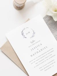
Perusing our wedding invitation gallery, I happily stumbled upon Pristine Beauty- a flat rectangle invite with a horizontal layout.
Modern and fresh with lots of white space, the seemingly heavy monarch palette looks light and airy on this design.

I kept playing in Design Studio our gallery til I got to Graceful Wildflower another flat rectangle invite, horizontally laid-out. More dramatic this time with the full color of sunset behind the wording, the forest green in the floral pattern background still strikes a beautiful balance.

What do you think of our monarch scheme on these two designs?
Flower Flourish on the left has the photo and the black border.
And, on the right without a photo is Floral Flourish.
Whimsical and fun, the flower silhouettes pop with intensity and color.
What do you think of using the monarch scheme for a fall palette- but in a light and airy way?
:)