 by:
by: It's Color Monday--the day devoted to color inspiration for your wedding palette!
Chartreuse {one of Pantone's fall 2012 colors} is not a color normally associated with a fall palette. We usually associate vibrant and light colors with spring. Think about a Granny Smith apple for a second ... pair it with caramel and you have an amazing combo. Just like coating the apple in caramel, paring chartreuse with deep tones and classic fall colors makes a delicious treat - for the eyes this time.
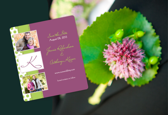
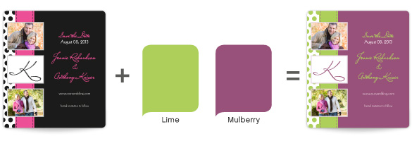
To start things off, we paired chartreuse with mulberry--a medium purple tone. In our palette, chartreuse is close to lime. Mulberry becomes a nice counterpoint to the bright hue that is both interesting and complementary. Here, we personalized a "Polka Dot Passion" Save the Date Magnet. Feel free to try it out on any of our Save the Dates!
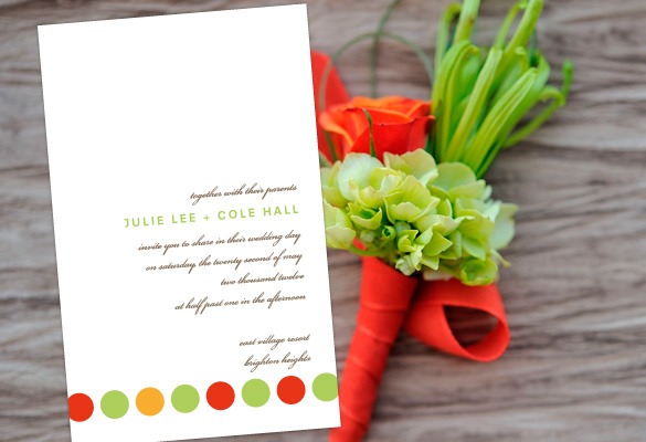
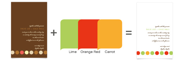
Choosing a classic fall color like orange, lime becomes a fresh and interesting pairing. These two colors are rather exciting together. They have lots of personality that leads you to believe this wedding will be fun and lively. With a bold combination like this, you'll have tons of fun. Here we personalized "Circle of Love" Rectangle Wedding Invitation but these same color choices would work just as well on a Pocket Wedding Invitation, try it for yourself!
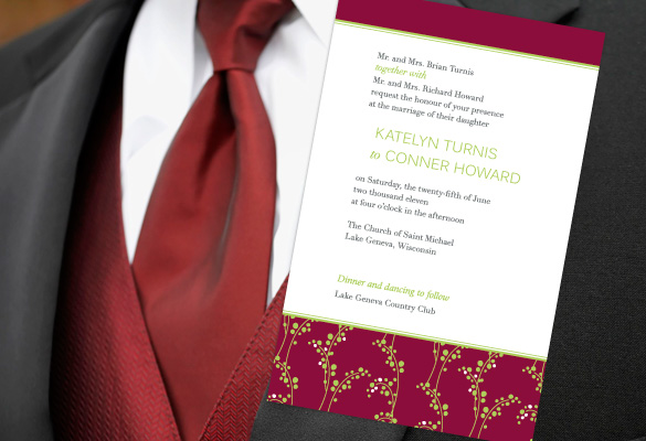
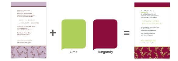
To tone things down, pairing chartreuse with a deep color like burgundy is always appropriate. The richness of the burgundy is a great counterpoint to the crisp green. This color combination is classic yet modern, perfect for a formal affair in late fall. We have many Classic Wedding Invitations for you to try this pair out on too!
As you can see, not only is chartreuse a fun color for spring, it can also be delicious in fall. What do you think? Would you use chartreuse for a fall wedding? Have you ever seen chartreuse used in a wedding?
Lindsay


