 by:
by: Hello & Happy Color Monday!
Pantone's color of the year for 2012 is Tangerine Tango. This bright reddish orange has a lot of punch to it! I love that this bold color really holds its own and gives off so much energy. I'm ready to be woken up this Monday morning, are you?

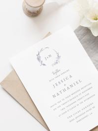
This Color Monday we're going for impact, so I'm taking some of our softer designs and using Tangerine Tango to spice them up! First off is Romance in Paris Wedding Invitations, an elegant and refined design--with an old-world feel. What a difference Tangerine Tango makes here, doesn't it? 'Muted' no more, this bright orange invigorates the look and feel of this design. I'll sit up and take notice of THIS wedding for sure.

Next, let's saturate Flower Enchantment Wedding Invitations with the color of Tangerine Tango. This simple and sweet design is more restrained and features a subtle flower element. What do you think of the spicy flavor Tangerine Tango gives it? I added two different photos to feature this awesome color even more. The graphic black and white contrasts with the bold orange to give off a look that's trendy and fun!

Lastly we'll be using Soft and Sweet Wedding Invitations. This design is unbelievably cute. WOW--what a difference! I love how graphic it is--changed in Tangerine Tango! How amazing that just changing the colors of the design could make such a difference. Now the flowers are bold and striking. This color combination gives it such a contemporary look!

Well, there you have it. Soft designs turned graphic and bold using Tangerine Tango. Incidentally, you could use any color you wish to do the same thing with these designs. Grey actually looked rather nice on most of them, and I'd love to see some bright blues as well. See for yourself in Design Studio!
To get Tangerine Tango--use these color {cmyk} values in Design Studio: C= 0 M= 83 Y= 95 K= 0
Are you awake now? Do you think you could Tangerine Tango for your wedding?