 by:
by: Guess what? It's Designer Week here at Truly Engaging! This week we will be featuring guest posts by our very talented in-house design team. They're responsible for creating all the beautiful Wedding Stationery designs available here at MagnetStreet Weddings. They are here to offer professional insight and inspiration on personalizing the design of your wedding stationery.

Today’s blog post is brought to us by Lindsay Neumann, Graphic Designer over here at MagnetStreet. A little from Lindsay about design:
“When designing a wedding invitation suite, I think about all the tiny details that come out during a wedding planning. I envision the bridesmaid dresses, the flowers, everything. I try to put details into each design that you can build upon with your wedding."
-------------------------------------------
Color creates the tone of your wedding. Whether you're looking for modern or traditional, bold or sweet, color can convey that tone for you.

For instance this design, Apple Blossoms, has very modern and trendy colors. The charcoal background is a softer version of jet black (very modern), and the cream color warms up the palette allowing the bright green to really "pop" (very trendy). The floral pattern is simple but engaging and perhaps that's the reason you love the design.
But...what if you love a design like the one above, but your wedding isn't going to be modern OR trendy? Fortunately, with MagnetStreet you can totally transform the tone of the design -- simply by changing the colors! Below are a few ways you can use color to match your design to the tone of your wedding.
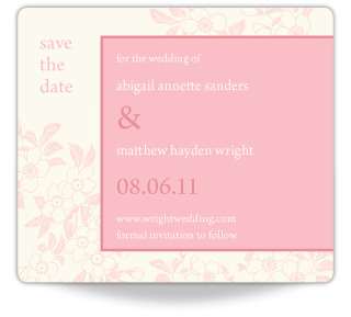
Perhaps you're having a simple and sweet spring wedding. Therefore, you're looking for a very soft and gentle feel for your wedding stationery. The flowers can appear delicate and lovely when they're showcased in a subtle palette of pinks. Perfect for a spring wedding!


Maybe your wedding is in the heat of the summer and you're looking to convey the relaxed warmth of a summer's night. The mysterious and romantic purple tones in this palette suggest sunset or candlelit wedding. How romantic...


Or, perhaps you're loving the energy of a circus wedding but aren't quite ready to jump into the theme head first. Just using the colors that inspire you can get you that much closer to the wedding of your dreams. The bold ruby red with the medium tone turquoise pop off the design with tons of energy, suggesting your wedding will be full of fun.

Isn't it amazing how much just the colors can change the entire look of a design?
Take a look at this Color Theory Guide for more color information and even more wedding color palettes. Some of those unique wedding color palettes are shown here:

As you're looking for your Save the Dates or Invitations, don't overlook a design that you love just because the colors aren't what you're looking for. Go ahead and fall in love with the design, knowing you can make it your own.
-------------------------------------------
Wow -- thank you Lindsay for showing us the power of color! Totally inspiring.
What about your wedding -- how will/did you use color to transform your Save the Date or Invitation? We'd love to hear about your own personalized wedding palette!


