 by:
by: 
The world of wedding invitations is a playground of creativity and style and we absolutely love it! The selection of fonts can dramatically influence the look and feel of your wedding invitation, setting the tone for the entire wedding. From classic to quirky, formal to funky, fonts play a crucial role in shaping the overall design and aesthetic. To demystify this crazy world of fonts, lettering, and typography, we have come up with a few tips and tricks for you to learn more about of fonts - designer approved! Let's dive into the fascinating world of wedding invitation fonts and explore how to choose, personalize, and play with fonts to create invitations that reflect your unique style and personality.
The Power of Fonts: Setting the Tone
Your wedding invitation is more than just a piece of paper with event details; it's a glimpse into the essence of your wedding. Fonts play a significant role in conveying the style and formality of the event. They are the visual voice that whispers to your guests what to expect. Whether you envision a traditional, elegant affair or a contemporary, laid-back celebration, your choice of fonts can bring that vision to life.
In the world of fonts, we have three main types: Serif, Sans Serif, and Scripts. Each type carries its own characteristics and personality, allowing you to tailor the design to match your unique style.
|
Image

|
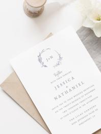
Serif Fonts: Identified by the small decorative lines or tails (serifs) attached and extended to the ends of characters. You can think of fonts like Times New Roman that you used for writing essays in your college years! Top serif examples for wedding invitations include Bulgar Regular, Mango Regular, and Branch Regular. They evoke a formal, traditional, and elegant feel. The serifs impart a sense of sophistication and readability, making it suitable for classic and timeless wedding invitation designs. |
|
Image

|
Sans Serif Fonts: Characterized by clean, simple lines without the decorative tails seen in serif fonts. Like the text I’m using right now in this blog! There aren’t any fancy lines extended from each character. Popular sans serif fonts in wedding invitations include Open Sans Regular, Hello Paris Sans Regular, and Urbanist Light. They convey a modern, clean, and minimalist look. The absence of serifs gives a contemporary and informal feel, making it ideal for modern and casual wedding invitation designs. |
|
Image

|
Script Fonts: These types of fonts mimic cursive or handwriting styles, often with flowing and connected characters, resembling elegant calligraphy we absolutely live for! In my opinion, this is what really makes the invite special! A few examples of script fonts include Salty Feathers Regular, Brand Stylist Script, and August Roma Script. They impart a sense of romance, grace, and personality, adding a touch of luxury and uniqueness and making them perfect for highlighting names, dates, and important headers in a wedding invitation. |
Personalizing Your Wedding Invitations: Playing with Fonts
The beauty of wedding invitations lies in their personalization. Fonts allow you to infuse your personality and style into the design effortlessly. Let's explore how you can play with fonts to create an invitation that speaks to you:
- Reflect Your Personality: Choose fonts that resonate with your personality and the theme of your wedding. Are you a free spirit? Opt for playful Sans Serif fonts. If elegance is your style, consider a blend of Script and Serif fonts.
- Contrast for Impact: A general rule of thumb is to use no more than two contrasting fonts. Combine a Script font with a Sans Serif font for a striking contrast. This pairing adds visual interest while maintaining readability.
- Consistency is Key: Be consistent with your font choices throughout the invitation. If you use a Script font for your names, carry it through to other important details like the wedding date. Consistency ensures a cohesive and polished look.
- Avoid Overwhelming All Caps: While all caps can be used for emphasis, using them extensively can make the text difficult to read. Reserve all caps for headings or short phrases to maintain readability and elegance.
Tips and Tricks for Font Selection
Choosing the perfect fonts for your wedding invitations can be a delightful journey. Here are some tips and tricks to guide you along the way:
- Try Before You Choose: Utilize design tools like Truly Engaging’s Design Studio to experiment with various fonts. Seeing your names or event details in different fonts will help you visualize the look and feel of the invitation.
- Consider Readability: Ensure that the chosen fonts are easily readable. Consider the size of your font. Depending on the thickness of the font, a general rule of thumb for serif and sans serif fonts is to have 7-10 point as the minimum. This is not only for readability but also for printability! The bigger the better!
- Pair Wisely: Pair fonts that complement each other and create a harmonious visual balance. Avoid using two different script fonts or fonts that clash in style and tone.
- Test with Colors: Experiment with different colors in the Design Studio to find the perfect match. Colors can drastically influence how a font is perceived and how well it blends with your overall wedding theme.
Contrasting Fonts: Creating Visual Interest
In the realm of wedding invitation design, creating visual interest is key, and fonts play a pivotal role in achieving this. Contrasting fonts, such as pairing a Script font with a Sans Serif font, not only make your invitation visually captivating but also direct attention to the wording you want to highlight. The juxtaposition of different font styles can set a delightful visual rhythm, enhancing the overall appeal of your invitation.
Tips for Choosing Contrasting Fonts
- Seek Inspiration: Explore a variety of invitation templates at Truly Engaging, especially those aligned with your wedding style. See how the designers have paired fonts, and draw inspiration from their combinations.
- Communicate Your Vision: When using Design Studio, communicate any specific design requests you have, especially regarding font style and placement. Providing clear direction ensures that the designers understand your preferences and bring your vision to life.
Creating Contrast with Colored Fonts
Colors are a powerful tool in design, and they significantly influence the tone and feel of a wedding invitation. Certain colors inherently create more contrast, effectively grabbing attention. Warm colors like reds, yellows, and oranges are attention-grabbing, requiring minimal application to make an impact. On the other hand, cooler colors like blue and green need more presence on the invitation to achieve a similar level of contrast.
Tips for Choosing Colored Fonts
- Consider Font Style: Assess the font style you've chosen—whether it's bold and thick or light and wispy. This evaluation helps determine the best color to create the desired contrast.
- Matching Colors and Fonts: Warmer colors like reds and yellows pair well with light and wispy fonts, enhancing visibility. Cooler colors like blues and greens work effectively with bold and thick fonts, ensuring clarity and contrast.
- Account for Background Color: When opting for a colored font, consider the background color of your paper. Contrast between the font and the background is crucial for readability; for instance, a yellow font on a white or cream-colored paper will not stand out effectively. Black and white is a go to, but you can create contrast with many other colors! Experiment in the Design Studio or browse wedding color trends and discover amazing color choices that suit you!
Script Fonts: Adding Drama and Personality
Script fonts are akin to decadent desserts—they're best in moderation but add a touch of drama and personality when used thoughtfully. These elegant fonts find their perfect spots in your wedding invitation, infusing a sense of charm and uniqueness.
When to Use Script Fonts
- On Your Names: Elevate the presentation of your names with the grace of a script font. It adds a personal touch and sophistication to the invitation.
- With Your Wedding Date: Utilize script fonts to display your wedding date. It brings a sense of elegance and importance to this significant detail.
- On Titles and Headers: For items like Programs, Reception cards, and more, script fonts can be employed for titles and headers, introducing an element of style and capturing attention.
When Not to Use Script Fonts
- On Maps: Script fonts are not suitable for intricate details like maps, where readability is essential. They may make the information difficult to comprehend.
- In Large Paragraphs: Avoid using script fonts for large paragraphs, as the elaborate loops and curls can hinder readability and overwhelm the reader.
- On Quotes: When incorporating quotes, be cautious if the script font has complex loops, as it may render the text hard to read. Opt for a more legible font style - your guests will thank you.
Fonts for Other Wedding Stationery: Beyond Invitations
When it comes to your wedding, the invitations are just the beginning of the font journey. Extending the discussion beyond invitations, fonts also play a crucial role in other wedding stationery, including programs, menus, place cards, and thank-you notes. Ensuring a cohesive font theme across all wedding materials creates a seamless and aesthetically pleasing experience for your guests.
Maintaining Consistency Across Wedding Stationery
- Font Choice Continuity: Select fonts that harmonize with the ones used in your invitations. This consistency helps in maintaining a cohesive theme throughout your wedding stationery, creating a polished and elegant look.
- Hierarchy and Readability: Pay attention to font hierarchy and readability, especially for items like programs and menus. Ensure that important details are presented in a clear and easily readable font to guide your guests smoothly through the event.
Tailoring Fonts to Each Wedding Element
- Programs: Consider using a clear and readable font for the program, ensuring that the order of events and details are easily accessible to your guests. You may also incorporate a font style that aligns with the overall theme of your wedding.
- Menus: For menus, match the font style with the ambiance of the dining experience you aim to create. Elegant script fonts can add a touch of sophistication to formal sit-down dinners, while playful sans serif fonts may suit a more casual and relaxed dining atmosphere.
- Place Cards: Choose fonts that reflect the table setting and décor. Script fonts can add an elegant touch to place cards, enhancing the visual appeal of your table settings and making each guest feel special.
- Thank-You Cards: Maintain consistency with the fonts used in your invitations. Express your gratitude to your guests with a font style that resonates with the appreciation and love you want to convey.

Your wedding stationery, encompassing invitations, programs, menus, place cards, and thank-you notes, presents an opportunity to showcase your attention to detail and design aesthetic. By extending your font choices consistently across all elements, you create a unified and visually pleasing presentation that enhances the overall wedding experience. Let your fonts tell a story that flows seamlessly through every aspect of your special day.