How To Choose Your Wedding Fonts
Welcome to our new blog series: Top Insider Tips for Printing Perfect Stationery. The second post in our series is about choosing your wedding fonts for personality and of course, printability.

What's in a wedding font? A lot.
The right wedding fonts will complement your design, draw attention to your names, and be an extension of your wedding style. Truly, the right font can completely alter the tone of a design. They're powerful things, those fonts.
Wedding fonts 101: 3 types
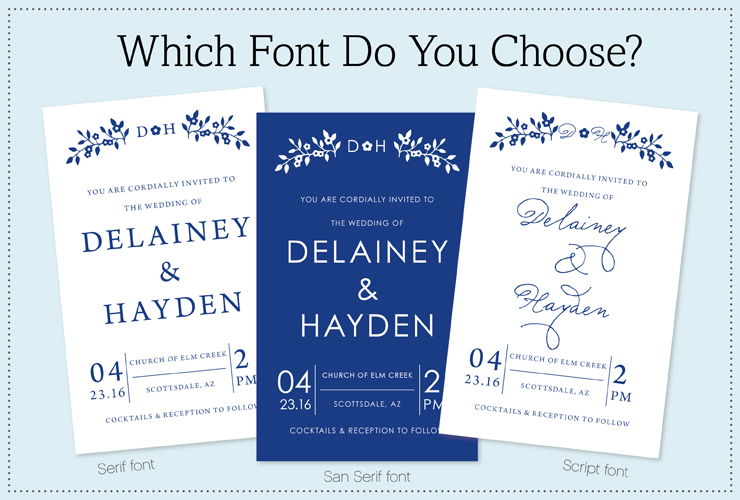
- Serif: Typeface that has an extra line that juts off the stroke of a letter. Considered more formal.
- San Serif: Does not have the extra line that juts off the stroke of a letter. Considered less formal (easiest to read).
- Script: Graceful typeface that looks more like calligraphy. Can be both formal or informal.
Contrasting fonts
Generally speaking, you'll want to use two contrasting fonts i.e. Script paired with a Sans Serif. Contrasting fonts will not only make your invitation visually interesting, they will draw attention to the wording you want highlighted.
Tips for choosing your fonts at MagnetStreet
- Get inspired by browsing a variety of invitation templates {in your wedding style} to see how and which fonts the designers have paired up.
- Communicate your special design requests! You can do a lot in Design Studio {MagnetStreet's online editing tool} but not everything. Let your requests be known so your designer has clear direction on font and placement. Want that scripty font with the ornate loops but can't get the placement right so it doesn't touch the text underneath? Simply write a "special note to the designer" so they don't assume you want text to touch.
Creating contrast with a colored font
Colors also have an amazing effect on the tone and feel of a design. Some colors create more contrast than others. For instance, reds, yellows, oranges do a great job of getting our attention. Less is more with warm colors like these--meaning you don't need much to create impact. Conversely, cooler colors like blue and green need to work harder to gain our attention and therefore typically require more color on the invitation to gain contrast.
Tips for choosing colored fonts
- Consider the font style you are choosing. Is it bold and chunky or light and wispy
- Warmer colors {reds, yellows and oranges} look best on light and wispy fonts
- Cooler colors {blues and greens} look best on bold and chunky fonts
- Consider the background color of your paper with the colored font. A yellow font on a white or cream colored paper will not stand out very well!
When & when not to use Script fonts
Script fonts are like decadent desserts--we love them but they're best in moderation. Script fonts are used sparingly and when you really want to create drama and personality. Like in these cases:
When to use script fonts
- On your names.
- With your our wedding date
- On titles and headers i.e. your Programs, Reception items, etc.
When not to use script fonts
- Maps
- Large paragraphs
- quotes, if script font has loops it will be very hard to read
- On guest lists and return addresses
Top fonts from our designers
Need some ideas? Have questions? Ask us and we'll send you in the right direction for your wedding invitation, style and formality. To get you started, here are a few top fonts from our designers. Happy font-ing! Modern Tiffany Bernhard Modern Vintage/Classic Schmutz Pro Ministry Script Miss Lankfort Elegant Sudestra Bodoni Italic Linoscript Bold/Chunky Futura Extra Bold Candy Script ITC Machine Sans Avenir Helvetica Gill Sans Serif Arno Pro Clarendon Memphis Baskerville Century Gothic Script Sudestra

 by:
by: 


